Wednesday, January 17, 2007

Google to Offer Free Real-Time Quotes

Google is apparently working on a way to let the world have access to real-time stock quotes for free! Katie Stanton talks about it on the Google Blog. What would make it really interesting is if Google were to also start building a bunch of market tools around the real-time quotes. For example, real-time streaming stock charts with technical indicators -- something that one-ups StockCharts.com and Prophet.net. Or real-time scans of the market, such as looking for stocks showing unusual trading volume by 10:30am ET, or strongest movers in the last hour, or live market breadth indicators -- things that would make you hesistate paying money to Equis or Worden Brothers. Wouldn't it be cool if you could configure stock alerts that Google would send to your mobile phone to notify when particular criteria (even advanced technical criteria) are met for stocks on your watch list? I think they should call it Google Livestock. :)

Friday, December 22, 2006

Books on Developing Trading Systems

I was browsing through some books on Amazon.com about how to develop a trading system. If I were to buy any, these would be the ones:

The Encyclopedia of Trading Systems, by Jeffrey Owen Katz and Donna L. McCormick (2000)

Design, Testing, and Optimization of Trading Systems, by Robert Pardo (2003)

Thursday, December 21, 2006

IPO Stock Lockup Periods

I've been watching Jim Cramer's Mad Money TV show for a week now, and he keeps mentioning stock lockup periods which I knew nothing about and so searched the web to get the scoop. The most thorough explanation I found is this paper written by two professors from New York University's Stern School of Business. It's a 40-pager, and I haven't read it all yet, but here are the key bits filled in with details I gleaned from other parts of the web.

When a company goes public, typically a 15-20% stake is put up for sale to the public, with the remaining 80-85% still held by pre-IPO shareholders. Companies usually do not sell the shares directly to the public and instead retain the services of an investment bank that will underwrite the shares (i.e. agree to buy them from the company for a fixed price on a specified date), decide what the IPO price should be, and then sell the shares to the public on the open market. So the investment bank profits from the spread between the underwritten price and the IPO price. To successfully raise capital and profit from the spread, the investment bank must be able to generate demand for the IPO shares by judiciously setting the initial price and the initial supply of shares.

However, since pre-IPO shareholders own 80-85%, if they were allowed to sell at the IPO, the large selling or perception that large selling might occur would likely send the stock price lower immediately. That would not be good for raising capital or making money. To control for this risk, underwriters generally insist that pre-IPO shareholders agree not to sell their shares for a certain period of time -- the lockup period. There are no rules saying how long a lockup has to be, but most are 180 days from the date of the company's final IPO prospectus.

That stabilizes the supply of shares at the IPO, but what then happens when the lockup expires 180 days later? Those pre-IPO shareholders (except for insiders with further vesting periods) are now free to sell their shares on the open market! The extra supply of shares tends to cause a dip in the share price and increased trading volume. For detailed explanations why, you'll have to read the professors' 40-page paper. But the take-home point is that lockup expiration is linked to decreasing price with increasing volume and is something traders should be aware of when getting involved with stocks that IPO'ed less than 6 months ago. This is why Cramer keeps suggesting that you might want to wait until after the lockup period expires before buying certain stocks.

How do you know what stocks have their lockup period expiring? It's buried in the Forms S-1 and S-1/A filed with the SEC. For example, MA's lock-up agreement is here. But the easiest way is to visit EDGAROnline's IPO Lockup Period web page. It's possible to mess with the URL to look at lockup periods from the past, so you can see how often lockup expiration had an effect on price movement and volume for at least a few years worth of IPOs.

Monday, December 18, 2006

More on Evaluative Index

In a previous blog entry, I was experimenting with a different way of measuring the market breadth. I also posted that on an Investools forum, and another more experienced trader replied and asked:
  1. Have you compared your chart to a chart of a broad index such as the the SPX or OEX? How different is it?
  2. Could you gain the same info by looking at the strength of the trend on the indexes?
It got me thinking about this more, and below is the response I posted on that forum.

SPX and OEX are capitalization-weighted, but my chart doesn't take market cap into account. Every stock gets one vote toward the final count of uptrends, downtrends, and trading ranges. It seems similar to the trade-offs between cap-weighted vs. equal-weighted indexes. The information is related but not identical.

When looking at the trend strength on the indexes, the information you get depends a lot on how you determine trend strength. If you use ADX(14,14) with a threshold of >=25 to mean "trend exists", ADX confirmed the summer 2006 SPX uptrend on Sept 5. But if you use MA crossovers, such as the 10-20-30-50 EMA "ribbon" (where increasing space between the MAs means increasing strength), the ribbon confirmed uptrend on Aug 15 -- 3 weeks earlier than ADX, and it coincided with a resistance breakout. But, the ribbon isn't always earlier than ADX. For the May 2006 correction, ADX confirmed the downtrend two days before the ribbon did. (And BTW, 3 red arrows came even earlier, a full week before ADX - so it pays to remember the basic Investools method!) So both of these approaches seem like good techniques for measuring trend, and once they agree, trend-following techniques should really work - i.e. these are great ways to gauge market sentiment.

My chart is a different angle on the market trend. Are just a few companies driving the index move or many companies? How many companies are still in trading ranges? Is an upward move due more to an increasing number of uptrends or a decreasing number of downtrends? For example, the SPX had a brief upward swing at the end of June 2006. On the SPX daily chart, you see ADX falling, indicating decreasing trend strength. On my chart you can see it was due to a sharp drop in the number of downtrends; the number of uptrends did not increase significantly yet. So, this upward swing didn't have much oomph behind it for the bulls, but the sharp decline in number of downtrends was also a warning for the bears, even though the SPX did make a lower high.

Well, I'm still experimenting with this kind of market breadth indicator. Not sure yet if I can use this chart to trade profitably, because looking at the SPX chart really is much simpler. :) But it does seem to offer some useful insight when a trend reversal may be unfolding. I'm certainly curious to see what it has to say about the upcoming market top that everyone keeps talking about. Dec 14 was a nice strong day for SPX, but on my chart, the number of uptrends was actually slighly down. Hmmmmm.....

The Cramer Effect

I was watching Jim Cramer's Mad Money show on CNBC today, and on the show he mentioned two stocks that he thought were interesting for bullish plays at some point in the very near future: OMTR and GMKT. He said that both of these stocks had a "share lockup" expiring soon -- OMTR on Dec 26 and GMKT on Dec 20. This means that insiders who got shares before the IPO are not allowed to sell their shares until those dates. So with the extra supply hitting the market, he said to wait until after lockup expiration before buying. For technical traders, I assume that means wait for the pivot low after those dates.

But obviously, many people ignore his suggestion to wait! Check out what happened in after-hours trading for these stocks. People watching Mad Money are jumping in the instant that Cramer mentions the stocks!

OMTR shows a volume spike with big price movement just a few minutes after 6:00pm ET, which is when Cramer first talked about the stock on his show:
But there is a warning here. I checked the time-and-sales sheet, and at 6:02pm there were actually only 3 trades:
  1. Regular market close was 13.79.
  2. 18:02:37 - 100 shares @ 13.78
  3. 18:02:49 - 100 shares @ 14.65
  4. 18:02:49 - 900 shares @ 14.65
  5. After this point, price retreated to the 14.25-14.44 range within a couple minutes, and proceeded to the 14.10-14.20 range within a couple minutes after that.
So the "big move" in this case is a false one. Maybe someone messed up their limit order, or they entered a market order in the rush to try to get in fast.

GMKT is a similar story, with a much bigger price movement. This one occurs at about 6:15 ET, because that's when Cramer started talking about this hot Korean company that he thinks is "the next EBay" (here's another article about it) before everyone realizes that's what it is:
The time-and-sales sheet was a little more interesting here. The first few trades:
  1. Regular market close was 20.48.
  2. 18:11:01 - 500 shares for 20.74
  3. 18:15:18 - 280 shares for 20.90
  4. 18:16:28 - 800 shares for 21.43 (2x400 lots)
  5. 18:16:32 - 100 shares for 22.10
  6. 18:16:33 - 100 shares for 22.10
  7. 18:16:33 - 500 shares for 22.10
  8. 18:16:34 - 400 shares for 22.10
  9. 18:16:35 - 100 shares for 22.39
  10. After this point, price soared to 22.60's, hitting a high of 22.76 (at 18:20:08-10), before ultimately pulling back and resting at 22.30 (at 18:34:57).
So in theory, if you're very quick with order entry, you could possibly get an order in just before the rest of the Cramer crowd arrives and scalp a quick 4-9% or more with an after-hours day trade with a hold somewhere between 30 seconds to 4 minutes, assuming you can get your orders filled. Tricky though!

Probably much easier to play it the way Cramer suggested - waiting for the stock lockup to expire first, then buy off the pivot low. But I wonder how he knows that there's a stock lockup expiring? I couldn't find SEC filings for OMTR or GMKT explaining this.

Sunday, December 17, 2006

Good Mood, Bad Mood

I was reading a sample issue of the MarketWatch Options Trader newsletter, and the last section on how your mood affects trading caught my interest:
Did you know that your mood can play a major role in determining your ability to stick with your trading plan? A study by Knapp and Clark (1991) [Personality and Social Psychology Bulletin, Vol. 17, No. 6, 678-688 (1991)] illustrates how feelings of emotional distress can influence your ability to maintain discipline. Participants engaged in a laboratory simulation in which waiting patiently resulted in greater profits. Specifically, participants were asked to pretend they were fishing in a lake, and that they would be given a monetary reward for each fish they caught. Taking too many fish out of the lake early in the game produced immediate profits, but when fish are taken out early, fewer fish are left in the lake to reproduce, and thus, fewer fish can be taken out for a profit in the long run. Thus, waiting patiently to take out fish later is the most profitable strategy. Participants' moods influenced their ability to wait patiently and fight the urge to take profits too early. People in a down mood had difficulty waiting. They wanted immediate gratification, and believed that immediate profits would make them feel better immediately.

When you are in an unpleasant mood, you may have a strong need to feel better. How can you feel better? Making money usually makes you feel better. You can either take profits out of a winning trade immediately or you can make an impulsive trade to get a quick thrill. Your mood can make all the difference. It is useful to make sure you are in a good mood while trading. When you are in a bad mood, you may act impulsively in order to make yourself feel better.

Maintaining discipline is vital for trading success but it is difficult at times. The best ways to keep disciplined are to trade with a detailed trading plan, but this may not be enough. You must also make sure you are in a good mood. A good mood can mean the difference between trading impulsively and maintaining discipline.

Actually, it got me to look back at my trading notes for trades that went bad. But I didn't write down in my notes whether I was in a good or bad mood. The technical details are there, but nothing along the lines of "how do you feel?" Well, obviously good trades mean good mood, and bad trades mean bad mood, but that's after the fact. But I have noticed that exiting what was a winning trade at break-even before it turned into a loss or exiting a loser when it briefly became break-even have both been effective at keeping a good mood from turning bad. So there seems to be a tie-in here to money management -- for better or for worse, account health and psychological health are linked in a positive feedback loop, with proper money mangement being the only defense against "for worse".

In the 2003 revised edition of The Intelligent Investor by Benjamin Graham, the commentary on chapter 1 by Jason Zweig starts with a quote linking unhappiness with impatience:
All of human unhappiness comes from one single thing: not knowing how to remain at rest in a room. -- Blaise Pascal
And Jesse Livermore supposedly said:
Money is made by sitting, not trading.
Tough to do sometimes, for sure! To sit or not to sit, that is the question. Going with a detailed trading plan, as mentioned in the Options Trader newsletter, definitely seems the right way to go. Or at least not allowing discretionary decisions unless I'm in a good mood, meaning only when trades are profitable.

Monday, December 11, 2006

Getting the Story Behind the Story

Candlesticks can be tricky creatures. Often enough, I'm finding that it's worth taking a little bit of extra time to look at the intraday anatomy of a candle to get a better read on what the candle is actually telling you. It takes less than a minute to get the deeper insight. Here's an example from MSFT on Dec 8, which shows a bullish engulfing candle with decent volume:
Looks pretty good. On Dec 8, MSFT opened at 28.82 and closed at 29.40, a 2% move on volume that created the bullish engulfing candle! But take a look at MSFT's intraday chart (one-minute bars) for Dec 8:

WHOA, what's up with that last minute of trading? MSFT jumped from 29.07 to 29.40 in one minute? Uhh, hmm... There was volume to go with it, but just a few minutes before, there was an even larger volume spike but with a much smaller price movement. And I didn't see any news to drive such a move. Mysterious. In this case, I was curious enough to crack out the time-and-sales sheet and look at the tick-level data:

(Quick explanation of this T&S sheet. The "T" means a trade. The "A" and "B" are the ask and bid quotes; they change frequently per exchange, and you are seeing only the best quotes on that exchange's order book. Green highlight means the trade occurred on an uptick; red means on a downtick.)

I drew a yellow box around the key transaction that occurred at 29.40. It was a single big order for about 22.8M shares. An institution? An insider? Not sure (didn't see an SEC filing yet), but with the rest of the market trading in the 29.07-29.13 range, I'm inclined to go with the market's figure as the actual closing price. (Besides, after-hours trading closed at 29.20.)

In the end, excluding the large order still left a bullish engulfing candle, just not nearly as strong as the one we originally saw. But it is also helpful to know that some entity out there thought that 29.40 was a good price to grab 22.8M shares ($670M total) in a single last-minute blast.

Saturday, December 09, 2006

Edwards' and Magee's Evaluative Index using Wilder's DMI

In Technical Analysis of Stock Trends, Edwards and Magee describe a simple technique of measuring market breadth that they call the Evaluative Index (from Ch. 37, "Balanced and Diversified"). Construction of the index goes like this:
  1. Let's say you're watching the daily charts of 100 stocks.
  2. At the end of the week, mark each chart as being in an uptrend or downtrend.
  3. Tally the results to determine whether you are overall bullish or bearish, and to what degree.
They first described that technique in the 1948 edition of Technical Analysis of Stock Trends. Then in the 1970's, Welles Wilder described his Directional Movement system using the ADX and +/-DI indicators as a way to quantify the direction and strength of a trend. And now with price data just a URL away and computers to crunch all the numbers, we can calculate and chart the Evaluative Index ourselves. Here's the Evaluative Index using daily price data up to Dec 8, 2006 for a list of 1700 stocks and ETFs on my list:
I've modified the index construction to count uptrends and downtrends only when ADX >= 25. With ADX < 25, the stock is either basing or choppy, which just has to do with how frequently the +/-DI indicators cross. (I'm still experimenting with whether basing vs. choppy is a useful distinction.) The important part to look at is the relationship of uptrends to downtrends.

Notice in the week of May 9-16, 2006 that the number of uptrends dropped sharply, with the number of downtrends rising sharply the week after. As this crossover unfolded, it would have been wise to close bullish positions and then wait for a good entry for bearish trades.

Now look at the period from July-Nov. A crossover occurred in mid-Aug, this time with uptrends taking the dominant position and increasing in its dominance. The green "uptrends" line itself made a series of higher highs and higher lows. Broad market indexes (DIA, SPY, QQQQ) were definitely in an uptrend for most of this period.

So what's in store going forward? Of course, it's always hard to say for sure. What we can see so far is that in the first week or two of December, we see the green "uptrends" line hesitating. The red "downtrends" line is flat, but the yellow "basings" line recently had a sharp rise. For the broad market uptrend to continue, we'd like to see the green line avoid making a lower low. So it seems like a time to be cautious, but still bullish.

Wednesday, December 06, 2006

Tom Bulkowski on Price Patterns

The web site http://www.traderinterviews.com ran an interview on Dec 4, 2006 with Tom Bulkowski (author of Encylopedia of Chart Patterns and other chart pattern books), where he talks about how he looks for price patterns and his approach to trading in general.

Bulkowski has a web site (http://www.thepatternsite.com) where he lists all the price patterns from his book with a summary of identification guidelines and trading rules. He has a quiz section, with over 150 unmarked charts where you can practice identifying price patterns and he then gives you the answers. He also has a free download of software that can scan for price patterns and candlesticks, but I thought it was pretty hard to use.

But, between his interview and web site, I thought there was a lot of great material for learning more about trading using price patterns.

Monday, December 04, 2006

Shortcuts to ETF Holdings

I keep messing with my shortcuts to ETF holdings. The complete lists are not very convenient to get to from any of the regular places for doing market research. You can get Top 10 holdings easily, but not the complete list. I stuffed the shortcuts into a bunch of pick lists:

SPDR ETFs


iShares ETFs


HOLDR ETFs:

Sector Performance Analysis

I was wandering through Nasdaq.com and came across a link to BarChart.com that shows industry group performance over various time frames. I haven't had a chance yet to dig into how they calculate their performance charts, but looks pretty good so far. I don't think Yahoo, MSN, or Google have anything like this yet.

Saturday, December 02, 2006

Watch List for Week of Dec 4, 2006

Stocks in a strong trend that have pulled back into the 10-30 EMA price zone.

Bullish setups:
* MMC - Stock in wide trading range for 2 years. $32-32.50 is significant resistance area.
* HAS - One-month flag pattern. Strong volume on 10/30-11/3 suggests $26-27 area will have support. Stock pulling back to 20-EMA. If enter, set stop just below $26.
* MSFT - Possible bounce off 30-EMA with hammer candle.
* CAL - Pullback to 20-EMA. Strong volume on 11/15 suggests $40 is a support area.
* TWX - $20 should be strong support (it had been strong resistance) due to recent breakout above $20 on volume. Stock is coming back to retest $20 and bouncing off 20-EMA.
* CDWC - flag for 2 weeks. A close above ~$71 on volume would be the breakout.
* SMG - one-month consolidation. Look for breakout above $50 on volume. Also a Bollinger band squeeze play.
* CHH - at 20-EMA with hammer candle.
Bearish setups:
* RDN - stock went sideways to slightly down from Jul to Oct, when the market as a whole was in an uptrend. Downgap and continued fall on 10/19 from missing earnings by over 10%. Possible bounce off 20-EMA as resistance.
* CVS - began downtrend on 9/21 when Walmart announced its $4 prescription drug plan. Stock just bounced off 20-EMA and $29 level is serving as resistance. If enter, set stop just above $29.
Bollinger band squeezes.

Bullish setups:

* D - one-month flag, though not sure what's up with the Nov 1-2 price action.
* ED - one-month flag.
* FE - this one broke out already, making a new all-time high. It's also a BB breakout on the weekly chart, and trend on weekly chart is especially strong. Price action shows a lot of flags this year, and each one so far has successfully completed. Based on flag pattern, expecting stock to move to at least $63 before the next consolidation.
* AIZ - one-month flag, possible bounce off 20-EMA.
* OMC - one-month flag. Flag breakout would also be BB breakout. Bottom of flag is also right on top of 20-EMA.
* MDU - already broke out of a one-month consolidation, making a new all-time (38-year) high. MDU is a very steady stock. On monthly chart, price has been above 10-EMA continuously for over 3.5 years; it did the same thing before for 10 years (1989-1999). Based on flag breakout, expect price to move to at least $28-$28.25 before next consolidation.
* EAS - already broke out of BB and a 3-4 month symmetrical triangle with 150% of 30-EMA volume.
* BKC - breakout of flag and BB already happened on 11/30 with over 250% volume. Wait for retest of $18 or 20-EMA for lower-risk entry.
* XTO - breakout of flag and BB already happened on 11/28. Wait for retest of $48 or 20-EMA for lower-risk entry.
Bearish setups:
* CNO - in many recent months (but not always), a squeeze of the Bollinger bands was followed by a downward move. Expect possible bounce off 20-30EMA.
* HCR - topping pattern from Aug-Sep; broke 9-month support trendline on 10/6; 20-EMA has been resistance for the last month.
* SGY - VERY volatile stock, so be careful (smaller position size or use non-directional spread strategy). Bollinger bands are very tight compared to 2-year history. It is historically followed by an explosive 10% move with immediate explosive (sometimes stronger) counter-move. But initial direction is very difficult to predict reliably, even when using trend-following techniques. If using non-directional spread, consider closing the winning side first, due to the tendency for a counter-move.
* USPI - price is currently right at a resistance trendline drawn since Feb, and $26 seems to have been established as a resistance level. Could take bearish entry now with stop just above $26 or if closes above trendline with volume. All Bollinger squeezes since Feb have so far been followed by a downward move.

Monday, November 27, 2006

Reading Nasdaq Level II Quotes

I have sometimes used Nasdaq Level II quotes to super fine tune an entry or exit, though it is mind numbing to stare at those screens for any length of time. So far, how I interpret the Level II quotes has mostly been improvisational, but after watching it for a while, I can see how the market makers could play games with this stuff, by bluffing a bid/ask price in the second tier and quickly retracting it -- to make it look like a large "hidden" order that someone wants to sneak into the market to stay under retail traders' price alert radars.

I found a couple interesting forum articles that go a little bit deeper into that:
So far from what I've seen, imbalances over bid/ask sizes do generally play out as support/resistance, respectively. But the quotes changes so fast that it's hard to get a clear read on its significance. The best you could do is squeeze out a few extra ticks for an entry/exit or scalp trade. It would help lower risk, but it also seems like a ton of extra work. Not sure if this is really worth getting into. Plenty of people seem to become successful traders without Level II.

Sunday, November 26, 2006

ETF Trend Divergence

I've been looking more closely at ETFs again, specifically sector-related ETFs to track for ongoing top-down analysis. The issue with multicollinearity got me thinking about relative strength again. So far I haven't been systematic about assessing relative strength, and it just doesn't make sense to continue putting that on the backburner. I'm turning up enough trade setups with different scans that using industry group relative strength to filter and sort the scan results would be a great way to identify the absolute best opportunities.

So, while roaming around the web reading how others track sector ETFs, I came across a really good article in SmartMoney.com titled Profit From Sector ETF Trend Divergence. In addition to identifying the top three ETF families, it also talks about how you can use ETF trend divergence to make money during choppy, sideways markets. An excellent introduction to the topic! It also concludes by saying that if you spot the same divergences repeatedly, you are probably looking at institutional sector rotation.

Saturday, November 25, 2006

Watch List for Week of 11/27

Below are stocks that are in uptrends (based on ADX and +/-DI) that have pulled back to within 1% of the 20-EMA. Many are not yet ready for entry and still need more confirmation. Some already have a confirmed bounce off support. A few cases aren't trades that I'd take, but I want to see how they would turn out -- to see how reliably the +DI crossover high is followed by a successful bounce off the 20-EMA.
  • AYE -- a close above 44.50 would be a 5+ year high.
  • BCR -- resistance at 84.
  • BMET -- significant resistance at 39.10 (multiple touches over 2-year period), so a break above that would be huge. Recent candles show growing sentiment to turn price back up.
  • CDNS -- resistance at 19; close at 19.50 or higher would be 5+ year high; 20-EMA has held at support for the last 2 months. Recent candles show sentiment to turn prices back up.
  • GERN -- resistance at 9.
  • GSIC -- resistance at 18; it failed to hold as new support on the last retest from above.
  • IM -- resistance at 21; small ascending triangle; close at 21 or higher makes a 7+ year high.
  • IT -- resistance at 20.20; increasing volume on up moves; declining volume on down moves; close above 20.20 would make a 6+ year high.
  • KMX -- resistance at 48; next high would be an all-time high.
  • MAT -- resistance at 24; next high would be a 7+ year high.
  • PFG -- support bounce; weekly and monthly charts show healthy uptrend; pullback risk remains on weekly chart.
  • SNPS -- resistance at 23.
  • TAP -- +DI crossover high with pullback to 20-EMA. Significant resistance at 72. Stochastic and MACD are low.
  • TZIX -- symmetrical triangle with decreasing volume.
  • WAT -- +DI crossover high with pullback to 20-EMA. Resistance at 51. Support at 50.
  • ZNT -- flag setup; Bollinger band squeeze

Friday, November 24, 2006

Indicator Tutorials at Worden.com

The Worden.com forums have a lot of good information about what an indicator is measuring. They're presented in short (5-7 min) Flash videos that also show some features in the TeleChart platform. Although I don't use TeleChart (but plan to try it soon), the tutorials on the indicators were still very informative. The ones I found most helpful are:
There are many other short videos on those forums on a variety of topics, mostly related to how to use TeleChart. They're careful not to give advice on how to trade or interpret charts, saying it's beyond what they're allowed to do, but most videos give examples that hint at the possibilities, enough for you to know what to research next.

Tuesday, November 21, 2006

Trading Aphorisms

Trading advice naturally comes in aphorisms. I've collected a few here, though I don't know who originally said them. You've probably heard these before. Most just make sense and are good reminders when you start second guessing and psyching yourself out. I've certainly experienced that. A few are debatable depending on your trading style and need entire books to explain.
  • Buy low, sell high.
  • Buy high, sell higher.
  • The trend is your friend.
    • The trend is your friend until the end where it bends.
  • A rising tide lifts all boats.
  • Don't try to catch a falling knife. Pick it up off the floor.
  • Volume goes with the trend.
  • Manage your money well.
  • Control risk.
  • Take big profits.
  • Take small losses.
  • Don't turn a profit into a loss.
  • Don't add to a loss.
    • Losers average losers.
  • Don't overtrade.
  • Preserve your capital.
  • Never invest all your funds. Keep liquid.
  • Learn how to use orders properly.
  • Trade liquid markets.
  • Fully understand your motivation to trade.
  • Avoid the crowd.
  • Buy the rumor, sell the news.
  • Don't argue with the market. The market is always right.
  • Avoid fear and greed.
  • Don't buy or sell price alone.
  • Develop strategies that work for you and fit your personality.
  • Hard work is essential.
  • It has to be fun.
  • Assume personal responsibility for all market actions.
  • Establish a clear, precise plan of action.
  • Ignore the noise; follow the signal.
  • Patience is your edge.

Saturday, November 18, 2006

Beware Multicollinearity!

I was reading the BollingerBands.com tutorial, and the page about multicollinearity really caught my attention:
A cardinal rule for the successful use of technical analysis requires avoiding multicolinearity amid indicators. Multicolinearity is simply the multiple counting of the same information. The use of four different indicators all derived from the same series of closing prices to confirm each other is a perfect example.

So one indicator derived from closing prices, another from volume and the last from price range would provide a useful group of indicators. But combining RSI, moving average convergence/divergence (MACD) and rate of change (assuming all were derived from closing prices and used similar time spans) would not.
He goes on to explain that RSI, On Balance Volume, and Money Flow make a good combination for avoiding multicollinearity.

StockCharts.com also has an article on multicollinearity.

StockViewPoint.com says their trading signals are carefully chosen to avoid multicollinearity. Their studies combine the following:
  • Intermediate, 1 month and short-term trend lines
  • Overbought/sold indicators
  • Direction of last trade
  • Candlesticks patterns
  • Money Flow
  • On Balance Volume
  • Support and Resistance
  • Gaps and Spikes
  • Relative Strength vs. market
  • Relative Strength vs. industry
  • Industry trend
Personally, I've been gravitating toward using:
  • ADX/DMI for trend
  • Support and resistance
  • Price patterns - especially new highs breaking out of consolidations
  • Candlesticks
  • Stochastics
and applying them to daily and weekly charts.

After reading the StockCharts.com article, I'm noticeably missing is some kind of volume indicator. Normally I just eyeball the volume, looking for a volume surge to back the entry signal provided by the other indicators. But now I'm thinking that adding Chaikin Money Flow or On Balance Volume would make it more systematic.

Watch List for Week of Nov 20

Bullish engulfing candles:
  • AEE - stock in an uptrend. The bullish engulfing pattern is at the support trendline. It's also a Piercing Line candle relative to the down candle on 11/15. MACD and Sto are low and curling up.
  • GIS - long-term uptrend. ADX above 25 on weekly chart. Stock trading near its all-time high. Stochastic showing bullish breakout signal. MACD is low and curling up. The bullish engulfing candle bounced off the 30-EMA with 150% volume. Bollinger bands are squeezing, and an upside breakout from the bands would mean closing at a new all-time high.
  • NTLI - stock in a 10% trading range. Bullish engulfing candle bounced off support around $24.10 with 300% volume. Possible bullish trade with quick exit (or sell half) around $27.
  • PDS - stock in downtrend (so warning). But, stock has shown two bullish engulfing patterns in a row at a major 2-year bottom, with the second engulfing pattern gapping up from the first pattern with 350% volume. MACD histogram just gave its bullish breakout signal, and Stochastics is about to. Even a move up to the 50-EMA would be a 10% rise. If the downtrend is over, the risk-to-reward is excellent. Even if not, could exit half (or all) of the position if the move reaches ~$27.30. A hesitation at $25.50 resistance would be a warning to get out fast.
Bearish engulfing candles:
  • EWBC - stock in short-term downtrend, intermediate-term 10% trading range. The downswing in Oct pushed ADX above 40, but after the more recent upward retracement, MACD and Stochastics are now both in the overbought zone. Bearish engulfing candle came with 120% volume. With ADX still above 25, and -DI over +DI, and the candle bouncing down from the 20-EMA, this seems to point toward a further move down. A close below $36 would be a new significant low.
  • LUV - stock in a downtrend. Bearish engulfing candle comes after what may be an exhaustion gap with a (somewhat) hanging man candle. Possible bounce off upper Bollinger band. Fibonacci retracement (from high on 10/13 to low on 11/03) shows the bearish engulfing candle bouncing off the 61.8% retracement level.
New 200-day highs with volume:
  • TKLC - uptrend, ADX above 40 and rising, +DI above 30 and rising. Made new high with more than 170% volume. If take the trade, stay in as long as the close stays above the 10-EMA.
  • MLHR - no clear trend, but the 13% up gap on 9/21 was a new-all-time high and it recently made another new all-time high. There was a recent breakout from a consolidation flag, which coincided with a breakout from the Bollinger bands, but with not much volume, and it looks to be coming back for a retest. ADX shows strength in both weekly and daily charts and is rising in both charts. If the flag pattern plays out, there should be a move to at least $39.50, based on the height of the flagpole.
Others:
  • ALV - recent upside breakout from a long trading range that ended with an ascending triangle. Appears to be coming back to test the $57.65 old resistance/new support level.

Friday, November 17, 2006

Interviews of Top Traders

I stumbled across TraderInterviews.com while roaming through some news. Very interetsing site! They have interviews recorded with today's top traders asking the usual questions of how they got into trading and what kinds of strategies, patterns, and tools they like to use. I've found that listening to top traders talk about their craft is an excellent way to keep my learning focused on the right things. Sometimes I'll pass up on a technical analysis technique because it just sounds too weird initially, but when I hear an experienced trader talk about how useful the technique is, I'll go back and give it a real, serious look for what I missed.

Thursday, November 16, 2006

Recognizing Candlestick Patterns Properly

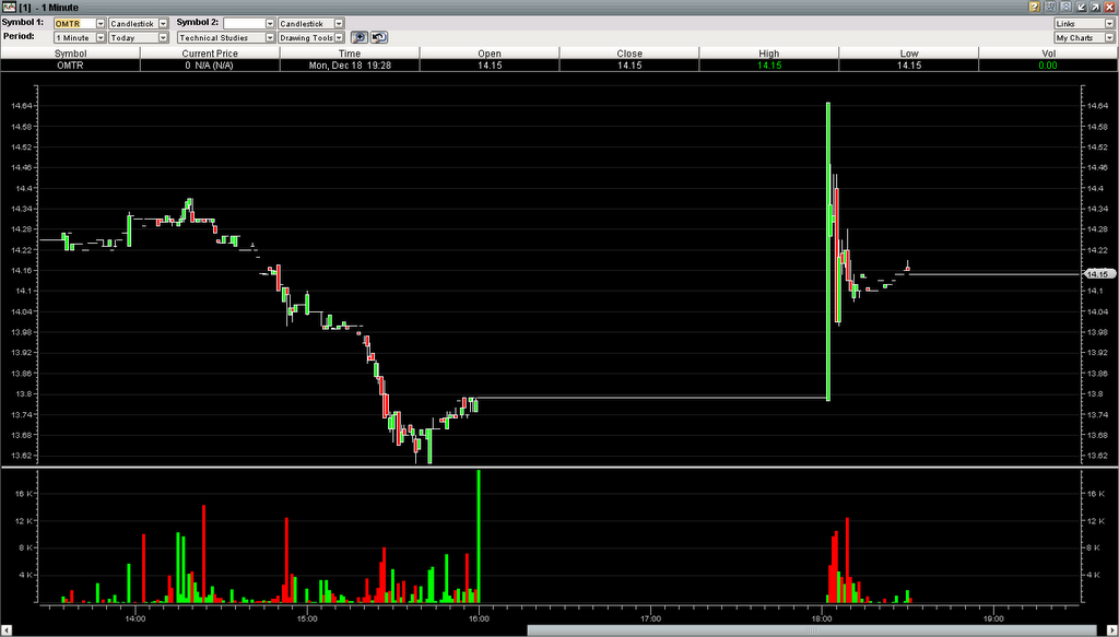
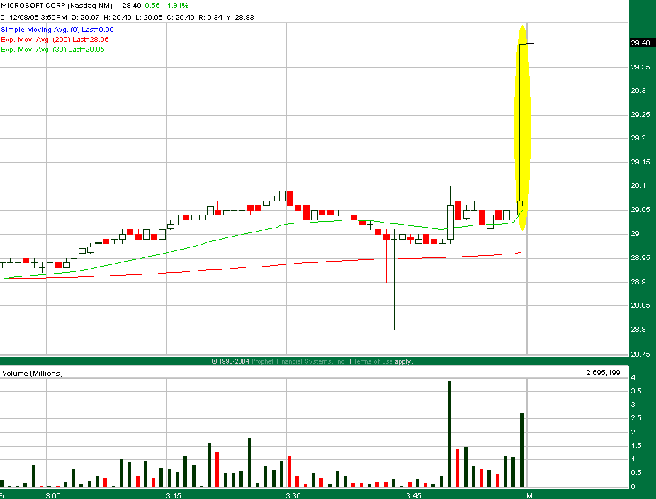
Ever since I learned about candlesticks, they've been my chart type of choice. They're definitely easier to read than the traditional bar chart, even when color coded. Though sometimes I will use a line chart plotting only closing prices for checking support and resistance levels.

Later on, I read about candlestick patterns. They were initially tough for me to accept. With strange names like Engulfing Pattern, Harami, Dark Cloud Cover, and (yes) Marubozu, I was just plain skeptical -- "how is this going to help me trade better?" I tried them anyway and had dismal results. They don't work! Friends who had learned about them too had similar experiences -- everyone getting burned on the supposedly powerful engulfing patterns, etc. So why is there so much talk about candlesticks, even whole books on the topic?

It turns out I missed a few important details on how to recognize candlestick patterns properly. It was deceptively easy to see the one, two, and three candle patterns and try trading off them. But thinking those by themselves were sufficient trading signals was a true rookie mistake. For candlestick patterns to give their benefit, they need to be found in the right market environment -- namely trend combined with support and resistance (S/R) -- and be accompanied by the right confirmation and/or indicators. When done properly, several different books say that candlesticks can help you achieve a 70-80% win ratio in trading. Of course, I was thinking to myself that if I had such bad experiences with it before, how is 70-80% wins possible? As I read on in various books, there were a few key points that completely changed the way I now look for candlesticks.

First, the trend. Consider the Bullish Engulfing Pattern, usually depicted like this:

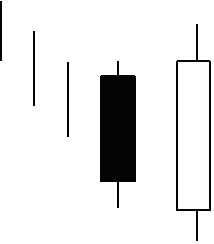
The three vertical lines to the left mean that before the pattern occurs, the price should be headed down coming into the engulfing candle. Then when you see the bullish engulfing pattern, it signals a likely reversal. The mistake I had been making is that I would look for this pattern in a downtrend. But a higher probability approach would be to look for this pattern in a pullback/downswing within an uptrend. Then when the reversal comes, the trade goes with the trend instead of against it.

Second, support and resistance. For reversals, it's better if the candle pattern is at or near a bounce off of support (for bullish patterns) or resistance (bearish). It provides the assurance that the needed buyers/sellers to fuel a bullish/bearish reversal are likely to be there, reducing the risk of the trade and increasing its probability of winning.

Third, confirmation. Some patterns need one additional candle to confirm the pattern:
  • Tombstone Doji and Dragonfly Doji
  • Hammer and Inverted Hammer
  • Hanging Man
  • Shooting Star
The confirming candle should at least show movement between its open and close that is in line with what the pattern is forecasting. And it should come within 1-2 days after the pattern. Ideally, it would close in the direction of the reversal. Without confirmation, trading off these patterns is more risky or aggressive than necessary. Also, for all of the above candles, the longer the shadow, the stronger the signal for a reversal.

Other patterns don't need a confirming candle, through the trend and S/R are still essential:
  • Bullish/Bearish Engulfing Patterns
  • Bullish/Bearish Harami
  • Dark Cloud Cover
  • Piercing Line
  • Morning Star
  • Evening Star
The point about identifying the right trend can't be emphasized enough. Look for Bearish Haramis and Shooting Stars in a downtrending stock! But with an upward retracement heading into the pattern.

Fourth, indicators. Any additional indicators pointing in the same direction will help increase the probability of success. Stephen Bigalow gives greatest emphasis to the stochastic oscillator. Other authors mention MACD, RSI, CCI, ADX/DMI, etc. All of them suggest that whatever indicator you use, it's a bad idea to trade against the indicator, since it would mean there is some opposing momentum that the trade would have to fight.

I still have quite a ways to go before mastering candlestick charting. But at least the basics are taken care of now.. I hope. :) Time to scan and backtest.

Bookmarks for ETF/Index Components

These are bookmarks to Yahoo Finance for certain ETFs/Indexes and some (or all) of their components as of yesterday or today, sorted by weight in the ETF/Index (usually market cap):

Tuesday, November 14, 2006

More Books

Trading Chaos: Applying Expert Techniques to Maximize Profits
by Bill Williams
  • Williams says he is able to use chaos theory to capture 80% of a trend's move, compared to 30% of the move that most traders get.
  • Uses the "fractal of the Elliott Wave" (?) and the science of chaos to look closely at acceleration/deceleration in market momentum.
Profitable Candlestick Trading
High Profit Candlestick Patterns: Turning Investor Sentiment into High Profits
by Stephen W. Bigalow
  • Says that proper use of candlesticks for short-term trades (less than 8 trading days) can be 80% wins, with the 20% losses being small in size due to using tight stops with the candlestick patterns.
  • Says candlesticks can be used very effectively to enhance other technical analysis.

Sunday, November 12, 2006

Watch List: Bullish Engulfing Candles

I was looking at stockcharts.com's scan for bullish engulfing candles. Some interesting possibilities below.

Bullish engulfing candles:
  • CEGE - On Nov 10 with very strong volume at the bottom of a downward move. MACD and Sto are low and curling up. Parabolic SAR giving buy signal.
  • EGP - On Nov 8 & 10. I suppose the Nov 10 candle confirms the Nov 8 candle. There are also dojis and an inverted hammer on the preceding days. Sto is giving buy signal. MACD is curling up. But, ADX made a lower high during the last price high.
  • CG - On Nov 8, candle closed at CG's then all-time high and closed above the upper Bollinger band. ADX rising with +DI making a new high.
  • CHKP - On Nov 10, after a down candle that retested a new support level from a consolidation breakout. It closed outside the upper Bollinger band. ADX line is rising again, and MACD histogram is giving buy signal.
  • GVA - On Nov 10 and 8. MACD and Sto giving buy signals. However, volume was relatively weak, and ADX is not confirming the trend. If enter, put stop just below the rising trendline.
  • IPXL - On Nov 10 with very strong volume; highest close since Jun 12. Highest volume day ever for IPXL since going public in Aug 2005. +DI above -DI with ADX rising and already above 30.
  • TMO - On Nov 10, candle fully engulfed the trading range of both Nov 9 and 8 on strong volume, with a breakout from a short-term consolidation zone. The Nov 10 close is TMO's all-time high, and it was also above the upper Bollinger band. MACD giving buy signal, and Sto turned up. ADX is still rising with +DI far above -DI.
  • VC - Nov 10, in the middle of an upward move. Nov 8 was a fairly strong move, and +DI crossed above -DI on that day. MACD and Sto gave their buy signals on Nov 7. Could take this as an aggressive trade using ADX and +/-DI indicators.
  • VMSI - Nov 10 candle engulfed Nov 9 and 8 with very high volume. The $42 level is now serving as support, after it had been resistance for almost 2 months. +DI crossed above -DI on Nov 7 on the gap up.
  • VRGY - Nov 6-10, two bullish engulfing candles with strong volume. $15 is firm support. If enter, set stop just below $15. MACD and Sto are low and curling up.
Bearish engulfing candles:
  • NIHD - Nov 10. But, MACD and Sto are already low, and ADX and +/-DI haven't confirmed the downtrend yet. So watch for a couple more days before deciding.
  • ZOLT - Nov 10 completely engulfs Nov 9 and engulfs body of Nov 8. This is also a retest of the $23.75-$24 resistance level, which had been the support level of a consolidation zone from Sep-Oct. This appears to confirm the downward breakout from consolidation. -DI is already above +DI. If moves down, expect resistance at $22, $20, and $18. Set set at $23.65.

Stock Scans at StockCharts.com

StockCharts.com has several technical scans that it runs on end-of-day data - you can view the results for free.

Saturday, November 11, 2006

Snap Sheets from Worden Brothers

Worden Brothers, the esteemed creators of TC2000, now have a free charting program called Snap Sheets. It has support for charting fundamentals, comparisons with industry, and for programming your own custom indicators by writing .NET code (C# or VB.NET). Right now, you have to subscribe to a TeleChart service in order to get price data; getting fundamental data costs extra.

Kicker Signal Setups

I wrote a scan for stocks currently with the Kicker Signal setup. As of today (Nov 10), here are the best ones:
  • AIG -- bullish kicker. In uptrend, strong volume, Bollinger band breakout, ADX rising with +DI well above -DI, MACD histogram gave buy signal 3 days ago, and stochastics showing momentum. The kick was also a breakout from a one-month basing pattern, and the Friday close is now testing a high from Jan.
  • PCAR -- bullish kicker. In long-term uptrend. Friday was PCAR's all-time high close. It happened on volume, with a Bollinger band breakout, MACD histogram buy signal, stochastic buy signal, ADX rising with +DI above -DI, and parabolic SAR buy signal.
  • EMR -- bullish kicker on Nov 7. The day after was EMR's all-time high close. Short-term uptrend. MACD buy signal, stochastic buy signal, ADX rising with +DI above -DI. Expect support at 86; if it pulls back to 86, that looks like a good entry.
  • DIS -- bearish kicker, blowout pattern. MACD and stochastic both in overbought region. ADX line declining, -DI rising sharply. Parabolic SAR showing sell signal.
  • EZPW -- bearish kicker with volume. Stochastic in overbought zone. Very strong divergence between MACD histogram and price. -DI crossed above +DI.
  • BGC -- bearish kicker (Nov 9) with very strong volume, stronger than the earlier gap down through support on Oct 31. Failed attempt to break back above the old support trendline on Nov 8; during upward move, volume weakened. Nov 10 was also a strong volume day (intraday chart shows strong selling pressure), with very limited upside momentum. ADX line is falling rapidly; the old uptrend is dead.
  • ING -- bearish kicker (Nov 9) with strong volume. -DI crossed above +DI and went higher than +DI's recent high. But, stay out if price on Monday opens in the gap.
  • RHD -- bearish kicker (Nov 9) with very strong volume. Stochastics in overbought, MACD histogram giving sell signal.
  • SLM -- bearish kicker (Nov 8) with very strong volume. Stochastics and MACD histogram in overbought zones. ADX rising with -DI over +DI.
  • WLP -- bearish kicker (Nov 8) with moderate volume. Volume increasing as price falls. ADX rising above 30 with -DI making higher highs. If enter bearish play, put stop loss at 73.65. Expecting stock to fall below 72.
  • XLV -- bearish kicker (Nov 8-9) with rising volume. -DI spiked up to meet +DI's last high. Thursday and Friday closing prices were outside the lower Bollinger band.

Candlestick Charting and Scanning

This intro to candlestick charting is very interesting. I was particularly intrigued by the Kicker Signal, which the author says is by far the strongest candlestick signal. I've started backtesting this to see just how strong it is, and it does seem to be true -- when you find the signal occurring in the right context and you have a combination of other indicators confirming, the trade has a high probability of success with a substantial profit.

The forums on Worden.com have a discussion thread about what formulas you can use to scan for candlestick patterns using TC2007. That thread also has a link to a variety of other topics -- such as scanning for divergences and price patterns.

Thursday, November 02, 2006

Technical Combination - DMI, 10/20 EMAs, MACD, Sto

This combination of entry rules:
  • Entry alert when +DI(14) crosses above -DI(14).
  • If ADX(14) is not rising, wait for it to rise before entering.
  • If EMA(10) is below EMA(20), wait for EMA(10) to cross above EMA(20).
  • Look to MACD(8,17,9) and Sto(14,5,0) for final confirmation of entry.
would have worked excellently with OSIR on Oct 9 (click to enlarge):


Exiting when MACD histogram peaked the first time after the entry would have gotten you out with a 25% gain on a stock trade. Or if you somehow had the guts to wait and sell at 19 or 20, it'd be about an 80% gain.

Wilder Directional System plays

Watching these:

The ADX(14) on FWLT broke above 30 on Oct 23, and FWLT's price is testing its SMA(20) today. The Wilder Directional System predicts that it should bounce up to at least its previous high.

PLXS ADX(14) broke above 30 on Oct 10. Price is approaching SMA(20).
NDAQ ADX(14) breakout on Oct 11. Price at SMA(20).
PLXS ADX(14) breakout on Oct 18. Price at SMA(20).
JNJ ADX(14) breakout on Oct 18. Price bouncing off SMA(20).
CMC ADX(14) breakout on Oct 20. Price still above SMA(20).
.... more later...

SGP ADX(14) had breakout, but price crashed through SMA(20).

Investing in Adult Stem Cell Research

A CNN Money article from August talked about how biotech companies working with adult stem cells are getting closer to producing treatments. The article mentions three companies in particular:
  1. ASTM (Aastrom Biosciences, Inc.) -- working on treatment to regrow bone tissue
  2. OSIR (Osiris Therapeutics) -- IPO'd on Aug 4. Just began Phase 3 trials for Prochymal for treatment of Acute Graft vs. Host disease, and Phase 2 trials (also Prochymal) for Crohn's disease.
  3. CYTX (Cytori Therapeutics, Inc.) -- working on using patient's adipose tissue for breast reconstruction

Wednesday, October 18, 2006

Extracting Fundamental Data from EDGAR

I've been thinking about writing a program to extract financial information from 10-K and 10-Q filings from the SEC's EDGAR database. The SEC has a manual for submission format. A couple German professors have been working on an edgar2xml tool.

Monday, October 16, 2006

Bollinger Squeeze Watch List

I've been downloading historical price quotes from Yahoo and started writing my own scans for technical indicators. The first one that I'm trying, because it's very easy, is the Bollinger band squeeze. Here's what I found for this week's watch list:

ADBE. Uptrend. One-month flag. Friday was an upside breakout of both the flag and upper Bollinger band with strong volume. Successful completion of the flag means making a new all-time (20-year) high.

DST. One-month flag off a minor uptrend. No breakout yet, but Bollinger bands are very tight - less than 3% from upper to lower band. The flag suggests an upside breakout, which would make a new 5-year high.

EFX. Screaming flag pattern. Flagpole broke resistance of about 33.25. So we'd expect a 10% move to the upside after a breakout, though a successful move would also require breaking the 38.50 resistance level. Coincidentally, FIC also has a Bollinger squeeze.

GT. Uptrend. One-month flag. No breakout yet. An upside breakout of the current flag would also break a key resistance level at 15. Flag predicts a 15-20% move after breakout.

K. Significant weakness. Broken neckline on a H&S top. Broken 5-month support trendline on price and RSI. Friday's trading gapped down on open and, by the close, broke the lower Bollinger band and the 100-day EMA on 150% volume.

PHG. Uptrend. One-month flag. No breakout yet. 35 is a key resistance area, and the flag is centered around it. An upside breakout would make a new 5-year high.

TROW. Uptrend. One-month flag. An upside breakout would make a new all time (20-year) high. But warning: MACD line and histogram both show bearish divergence, and RSI has been downtrending during the flag. Must wait for breakout.

Saturday, October 07, 2006

ALGN Litigation Conference Call

Here's the direct link to ALGN's conference call commenting on the settlement of the litigation with OrthoClear.

Saturday, September 30, 2006

How Yahoo Calculates the Adjusted Closing Price

For calculating adjusted prices, there are commonly two kinds of adjustments to consider -- stock splits and dividends. Stocks splits are straightforward. Since a stock split doesn't change the intrinsic value of the company, you recalculate historical per-share data (like stock price) to reflect the latest number of outstanding shares. Everyone seems to agree on how to do that, but adjusting for dividends is a different story.

There are situations where you may or may not want dividend-adjusted prices. For example, using adjusted prices makes it much easier to calculate the rate of return for a long-term investment (a stock held for years) since dividend payouts are folded into the adjusted prices. However, percentage profit and loss calculations of a short-term trade could be skewed by adjusted prices. That most likely wouldn't matter much for a trade happening right now, but it could profoundly affect backtesting results, especially for time frames that were years ago. So depending on your objective, you will need to decide whether or not you want to use dividend-adjusted prices and what kind (more below).

Not all charting sites adjust their charts for dividends. For example, StockCharts.com adjusts for dividends, but BigCharts.com and Prophet.net don't. Interestingly, Yahoo charts don't adjust for dividends, but Yahoo historical prices do provide a single adjusted closing price that includes both splits and dividends. Yahoo's technique for calculating the adjusted closing price looked a bit strange to me when I first saw it. I was expecting the dollar difference between the actual close and the adjusted close to stay the same for stocks that never split. But that's not how they do it.

There are two general approaches on how dividend adjustments are calculated. The first approach, described in this Investopedia article, is simply to subtract the dividend out of the stock price going back to the IPO and adjusting the dividend adjustment for stock splits along the way. It's as if the dividend never existed in the company. This approach is simple and gives accurate absolute profit and loss numbers when calculating the return from holding a stock long-term, over several dividend distributions. But there is a problem -- due to the effect of inflation, it's possible that the dividend adjustment will cause some adjusted historical prices to go below zero. Once that happens, percentage rate of return numbers are trickier to calculate, and negative stock prices in general don't make sense intuitively.

The second approach involves calculating adjustments in percentage terms instead of absolute dollar value. Yahoo uses this type of approach for its adjusted closing price. It avoids the negative adjusted stock prices but as a result skews profit and loss calculations. There is probably more than one way to apply percentage adjustments, so depending on the exact technique, results would vary. I looked closely at Yahoo's adjusted prices and came up with what I believe is their formula. Here it goes..

Yahoo's adjusted close calculation goes like this:
  1. For the latest available trading day, the actual closing price and the adjusted closing price are the same. (Base case)
  2. For every other day ("today"), determine what percentage today's closing price is over yesterday's closing price, excluding the effect of a dividend and/or a stock split, if today is the ex-date.
  3. You calculate yesterday's adjusted close as being the same percentage down from today's adjusted close as the percentage calculated in step 2.
  4. Repeat steps 2 and 3 for all other historic days.
Expressed as a formula:

A-1 = A0 + A0( ((P-1/S) - P0 - D) / P0)

where
  • A0 is today's adjusted price. A-1 is yesterday's adjusted price.
  • P0 is today's actual price. P-1 is yesterday's actual price.
  • S is the split ratio, if today is a split ex-date. For example, a 3-to-2 split means S is 1.5. S is 1 if today is not a split ex-date.
  • D is the actual dividend, if today is a dividend ex-date. D is 0 when not a dividend ex-date.
In the case of Yahoo, the D term in the above equation is the tricky part. It turns out that Yahoo reports dividend amounts in split-adjusted terms. So you have to unadjust the dividend amount before using it in the above equation! You can either multiply the Yahoo-reported dividend amount by the cumulative split factor, or you can get the actual dividend amount from another web site like earnings.com.

I ran a couple spreadsheets using that formula and was able to calculate exactly the same adjusted closing prices that Yahoo has. Great! Now I can use the same formula to get adjusted prices for the open, high, and low prices. Then it's onward to building more advanced technical analysis screens!

Wednesday, September 27, 2006

Searching EDGAR

Use this link to search for SEC DEF 14A filings for the month of Sept 2006.

Insidenewswire.com has an interesting summary of insider activity for the day.

Tuesday, September 19, 2006

CME Housing Futures

Starting in May 2006, the Chicago Mercantile Exchange started offering Housing Futures. There was a MarketWatch article in late May about it. The futures contracts are based on the S&P/Case-Shiller Home Price Indices, and the indices are currently calculated for 10 cities: Boston, Chicago, Denver, Las Vegas, Los Angeles, Miami, New York, San Diego, San Francisco, and Washington DC.

Even though I'm not planning on trading futures any time soon, following these particular futures could give an interesting read on where the housing market is going, since these indices are calculated based on recorded home sales prices and use a repeat sales methodology to try to isolate market changes (vs. change in value due to intrinsic property changes). Perhaps it will serve as a leading indicator for price performance of $HGX component stocks?

Monday, September 18, 2006

NAHB Housing Market Index

I was reading a Market Watch article on home builder confidence falling again in Sept. It mentions a housing market index produced by NAHB and Wells Fargo and how this index "has had a fairly good record of predicting the number of new homes started." NAHB has a web page for economic and housing data and it appears to give an excellent overview (they say "pulse") on how the housing and real estate market is doing overall and within each state.

Tuesday, September 12, 2006

Technical Analysis Reading List

I've been looking for an authoritative reading list for technical analysis and found one after wandering into Market Technicians Association, Inc. through an analyst's credentials. MTA is a non-profit organization whose stated mission is to "Educate the public and the investment community to the value and universality of technical analysis."

They have a rigorous, self-study certification program for technical analysis. To get certified, you need to pass three levels of testing (the final is an essay format) based on material you learn from studying the following books:

Level 1 (100 hours of studying)
Level 2 (140 hours)
Level 3 (160 hours)
That's a total of about 5400 pages of reading. To finish in 400 hours, it's about 4-5 minutes of study per page.

Tracking Oil Futures and Crack Spreads -- FTO, VLO

FutureSource.com has free premium charts for tracking futures prices. For example, for Oct 2006 delivery:
You can play with the URL to get different size charts, as big as you like. You can also do combinations with formulas like this:
For oil refining companies, the maximum possible profit is generally considered to be the revenue from selling gasoline and heating oil minus the cost of crude oil to produce them -- this is known as the "crack spread". The typical ratio in a crack spread is 3 barrels of crude oil produces 2 barrels of gasoline and 1 barrel of heating oil, which is known as the "3-2-1 Crack Spread". Since unleaded gasoline and heating oil are quoted in price per gallon, their prices need to be multiplied by 42 to get the price per barrel (42 gallons per barrel).

For most refineries, the crude part of the crack spread is the light, sweet variety. But two companies in particular have complex refineries that can handle a lot of heavy, sour crude instead, which is a lot cheaper than light, sweet crude -- FTO and VLO. Currently, San Joaquin heavy crude is about $53/B compared to $65/B for light-sweet. That $12 light/heavy spread is a source of additional profits for refineries specializing in heavy crude. Since most refineries use light, sweet crude instead, the prices of gasoline and heating oil are more strongly influenced by the price of light-sweet than heavy-sour. This means that companies like FTO and VLO can maintain excellent margins compared to companies that can only refine light-sweet, especially as the light/heavy spread widens -- i.e. as crude oil prices climb overall.

At the same time, when the price of crude falls, the heavy-light spread tends to narrow, thus decreasing the margins for FTO and VLO. So, if the price of crude continues to fall like it has for the last week, FTO's and VLO's stock prices may take an extra heavy hit, due to expectations of wider light/heavy spreads having previously been priced into those stocks.

Thursday, September 07, 2006

Homebuilders News

The homebuilders have been a somewhat news intensive group recently. Even with earnings downgrades, HOV and KBH both rocketed up during the day today, even after an opening downgap overnight. That consequently appears to have lifted the entire homebuilders industry group:

That image comes from a Yahoo comparison chart. See latest prices here.

BusinessWeek Online Hot Growth Stocks of 2006

In a previous blog entry, I mentioned the BusinessWeek Online Hot Growth Stocks of 2006 report, from the June 5, 2006 issue. It's a detailed report of 100 growth stock picks. I thought it'd be good to review this list to see how the hot growth stocks have done over the past three months, through the rough summer market.

Here's the Yahoo summary and the technical charts (long load time). Most of these growth stocks have ended up in down or sideways trends since early June. When I eyeballed the charts, only 16 out of 100 stood out as having a "hot growth" uptrend for the 3-month period starting in June:
  • NILE +13%
  • PSPT +15%
  • CTSH +11%
  • HITT +21%
  • WIRE +13%
  • ANST +14%
  • QSII +25%
  • LOJN +17%
  • BOOM +15%
  • VCLK +16%
  • VTIV +14%
  • DRIV +22%
  • TRMB +14%
  • HLX +18%
  • MCRS +14%
  • LMS +18%
The rest were down, flat, or not convincingly up enough to be "hot" IMO. But judge for yourself. There are only a few other stocks beyond these 16 that had a borderline 9-10% gain for the 3 months, though with a lot of volatility.

Wednesday, September 06, 2006

Online Book - Strategies, Sectors, and Economic Indicators

I was wandering through web searches looking for information on the 10-year Treasury Note ($TNX) and the 3-month Treasury Bill ($IRX), and came across a free online book titled Investment Strategies Using Stock Market Sectors, by George Dagnino. Dagnino mentions in Chapter 1 that he has experience managing $4 billion over a variety of asset classes.

I've just started reading the book, and so far Dagnino seems to recommend a very realistic, hype-free approach to the stock market, though with the occasional shameless plug for one of his books and his newsletters. Similar to Alexander Elder's book Trading for a Living, Dagnino emphasizes the importance of money management through a disciplined investment process where risk is constantly re-evaluated and the hallmark of a successful investor is predictable and stable returns. He also devotes some chapters to economic indicators and how they relate to stock sectors and business cycles. This looks like a good intro to financial markets.