Friday, December 22, 2006

Books on Developing Trading Systems

I was browsing through some books on Amazon.com about how to develop a trading system. If I were to buy any, these would be the ones:

The Encyclopedia of Trading Systems, by Jeffrey Owen Katz and Donna L. McCormick (2000)

Design, Testing, and Optimization of Trading Systems, by Robert Pardo (2003)

Thursday, December 21, 2006

IPO Stock Lockup Periods

I've been watching Jim Cramer's Mad Money TV show for a week now, and he keeps mentioning stock lockup periods which I knew nothing about and so searched the web to get the scoop. The most thorough explanation I found is this paper written by two professors from New York University's Stern School of Business. It's a 40-pager, and I haven't read it all yet, but here are the key bits filled in with details I gleaned from other parts of the web.

When a company goes public, typically a 15-20% stake is put up for sale to the public, with the remaining 80-85% still held by pre-IPO shareholders. Companies usually do not sell the shares directly to the public and instead retain the services of an investment bank that will underwrite the shares (i.e. agree to buy them from the company for a fixed price on a specified date), decide what the IPO price should be, and then sell the shares to the public on the open market. So the investment bank profits from the spread between the underwritten price and the IPO price. To successfully raise capital and profit from the spread, the investment bank must be able to generate demand for the IPO shares by judiciously setting the initial price and the initial supply of shares.

However, since pre-IPO shareholders own 80-85%, if they were allowed to sell at the IPO, the large selling or perception that large selling might occur would likely send the stock price lower immediately. That would not be good for raising capital or making money. To control for this risk, underwriters generally insist that pre-IPO shareholders agree not to sell their shares for a certain period of time -- the lockup period. There are no rules saying how long a lockup has to be, but most are 180 days from the date of the company's final IPO prospectus.

That stabilizes the supply of shares at the IPO, but what then happens when the lockup expires 180 days later? Those pre-IPO shareholders (except for insiders with further vesting periods) are now free to sell their shares on the open market! The extra supply of shares tends to cause a dip in the share price and increased trading volume. For detailed explanations why, you'll have to read the professors' 40-page paper. But the take-home point is that lockup expiration is linked to decreasing price with increasing volume and is something traders should be aware of when getting involved with stocks that IPO'ed less than 6 months ago. This is why Cramer keeps suggesting that you might want to wait until after the lockup period expires before buying certain stocks.

How do you know what stocks have their lockup period expiring? It's buried in the Forms S-1 and S-1/A filed with the SEC. For example, MA's lock-up agreement is here. But the easiest way is to visit EDGAROnline's IPO Lockup Period web page. It's possible to mess with the URL to look at lockup periods from the past, so you can see how often lockup expiration had an effect on price movement and volume for at least a few years worth of IPOs.

Monday, December 18, 2006

More on Evaluative Index

In a previous blog entry, I was experimenting with a different way of measuring the market breadth. I also posted that on an Investools forum, and another more experienced trader replied and asked:
  1. Have you compared your chart to a chart of a broad index such as the the SPX or OEX? How different is it?
  2. Could you gain the same info by looking at the strength of the trend on the indexes?
It got me thinking about this more, and below is the response I posted on that forum.

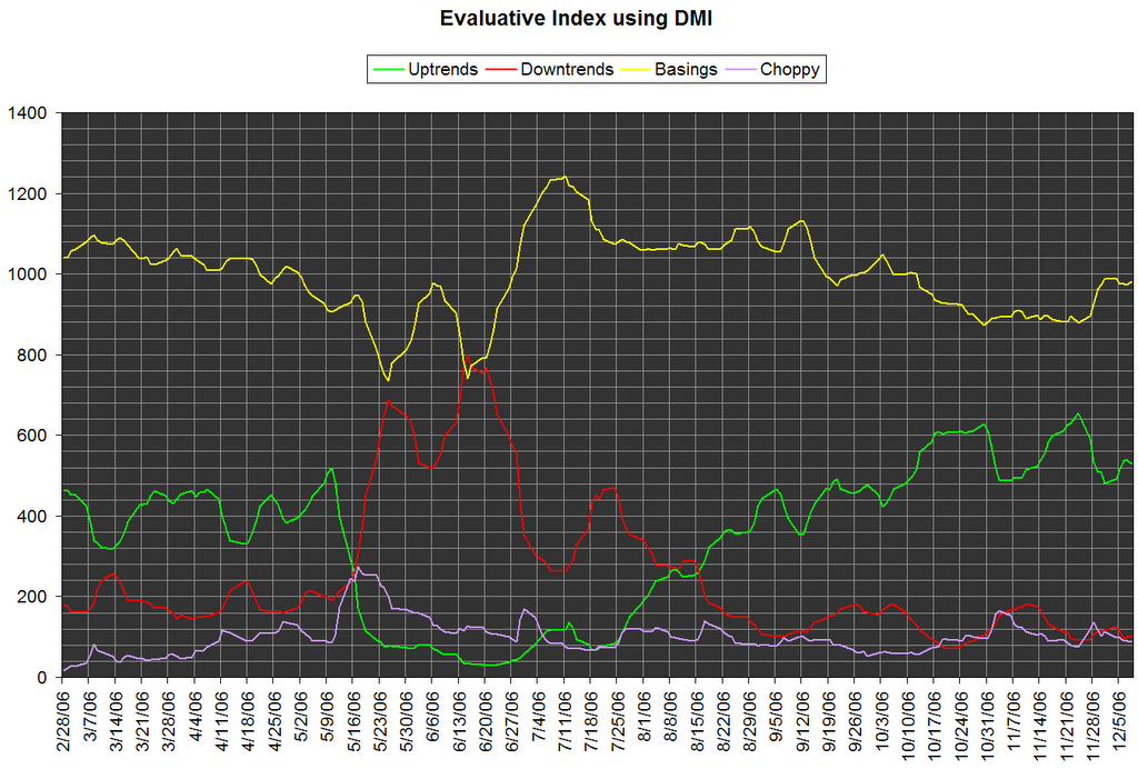
SPX and OEX are capitalization-weighted, but my chart doesn't take market cap into account. Every stock gets one vote toward the final count of uptrends, downtrends, and trading ranges. It seems similar to the trade-offs between cap-weighted vs. equal-weighted indexes. The information is related but not identical.

When looking at the trend strength on the indexes, the information you get depends a lot on how you determine trend strength. If you use ADX(14,14) with a threshold of >=25 to mean "trend exists", ADX confirmed the summer 2006 SPX uptrend on Sept 5. But if you use MA crossovers, such as the 10-20-30-50 EMA "ribbon" (where increasing space between the MAs means increasing strength), the ribbon confirmed uptrend on Aug 15 -- 3 weeks earlier than ADX, and it coincided with a resistance breakout. But, the ribbon isn't always earlier than ADX. For the May 2006 correction, ADX confirmed the downtrend two days before the ribbon did. (And BTW, 3 red arrows came even earlier, a full week before ADX - so it pays to remember the basic Investools method!) So both of these approaches seem like good techniques for measuring trend, and once they agree, trend-following techniques should really work - i.e. these are great ways to gauge market sentiment.

My chart is a different angle on the market trend. Are just a few companies driving the index move or many companies? How many companies are still in trading ranges? Is an upward move due more to an increasing number of uptrends or a decreasing number of downtrends? For example, the SPX had a brief upward swing at the end of June 2006. On the SPX daily chart, you see ADX falling, indicating decreasing trend strength. On my chart you can see it was due to a sharp drop in the number of downtrends; the number of uptrends did not increase significantly yet. So, this upward swing didn't have much oomph behind it for the bulls, but the sharp decline in number of downtrends was also a warning for the bears, even though the SPX did make a lower high.

Well, I'm still experimenting with this kind of market breadth indicator. Not sure yet if I can use this chart to trade profitably, because looking at the SPX chart really is much simpler. :) But it does seem to offer some useful insight when a trend reversal may be unfolding. I'm certainly curious to see what it has to say about the upcoming market top that everyone keeps talking about. Dec 14 was a nice strong day for SPX, but on my chart, the number of uptrends was actually slighly down. Hmmmmm.....

The Cramer Effect

I was watching Jim Cramer's Mad Money show on CNBC today, and on the show he mentioned two stocks that he thought were interesting for bullish plays at some point in the very near future: OMTR and GMKT. He said that both of these stocks had a "share lockup" expiring soon -- OMTR on Dec 26 and GMKT on Dec 20. This means that insiders who got shares before the IPO are not allowed to sell their shares until those dates. So with the extra supply hitting the market, he said to wait until after lockup expiration before buying. For technical traders, I assume that means wait for the pivot low after those dates.

But obviously, many people ignore his suggestion to wait! Check out what happened in after-hours trading for these stocks. People watching Mad Money are jumping in the instant that Cramer mentions the stocks!

OMTR shows a volume spike with big price movement just a few minutes after 6:00pm ET, which is when Cramer first talked about the stock on his show:
But there is a warning here. I checked the time-and-sales sheet, and at 6:02pm there were actually only 3 trades:
  1. Regular market close was 13.79.
  2. 18:02:37 - 100 shares @ 13.78
  3. 18:02:49 - 100 shares @ 14.65
  4. 18:02:49 - 900 shares @ 14.65
  5. After this point, price retreated to the 14.25-14.44 range within a couple minutes, and proceeded to the 14.10-14.20 range within a couple minutes after that.
So the "big move" in this case is a false one. Maybe someone messed up their limit order, or they entered a market order in the rush to try to get in fast.

GMKT is a similar story, with a much bigger price movement. This one occurs at about 6:15 ET, because that's when Cramer started talking about this hot Korean company that he thinks is "the next EBay" (here's another article about it) before everyone realizes that's what it is:
The time-and-sales sheet was a little more interesting here. The first few trades:
  1. Regular market close was 20.48.
  2. 18:11:01 - 500 shares for 20.74
  3. 18:15:18 - 280 shares for 20.90
  4. 18:16:28 - 800 shares for 21.43 (2x400 lots)
  5. 18:16:32 - 100 shares for 22.10
  6. 18:16:33 - 100 shares for 22.10
  7. 18:16:33 - 500 shares for 22.10
  8. 18:16:34 - 400 shares for 22.10
  9. 18:16:35 - 100 shares for 22.39
  10. After this point, price soared to 22.60's, hitting a high of 22.76 (at 18:20:08-10), before ultimately pulling back and resting at 22.30 (at 18:34:57).
So in theory, if you're very quick with order entry, you could possibly get an order in just before the rest of the Cramer crowd arrives and scalp a quick 4-9% or more with an after-hours day trade with a hold somewhere between 30 seconds to 4 minutes, assuming you can get your orders filled. Tricky though!

Probably much easier to play it the way Cramer suggested - waiting for the stock lockup to expire first, then buy off the pivot low. But I wonder how he knows that there's a stock lockup expiring? I couldn't find SEC filings for OMTR or GMKT explaining this.

Sunday, December 17, 2006

Good Mood, Bad Mood

I was reading a sample issue of the MarketWatch Options Trader newsletter, and the last section on how your mood affects trading caught my interest:
Did you know that your mood can play a major role in determining your ability to stick with your trading plan? A study by Knapp and Clark (1991) [Personality and Social Psychology Bulletin, Vol. 17, No. 6, 678-688 (1991)] illustrates how feelings of emotional distress can influence your ability to maintain discipline. Participants engaged in a laboratory simulation in which waiting patiently resulted in greater profits. Specifically, participants were asked to pretend they were fishing in a lake, and that they would be given a monetary reward for each fish they caught. Taking too many fish out of the lake early in the game produced immediate profits, but when fish are taken out early, fewer fish are left in the lake to reproduce, and thus, fewer fish can be taken out for a profit in the long run. Thus, waiting patiently to take out fish later is the most profitable strategy. Participants' moods influenced their ability to wait patiently and fight the urge to take profits too early. People in a down mood had difficulty waiting. They wanted immediate gratification, and believed that immediate profits would make them feel better immediately.

When you are in an unpleasant mood, you may have a strong need to feel better. How can you feel better? Making money usually makes you feel better. You can either take profits out of a winning trade immediately or you can make an impulsive trade to get a quick thrill. Your mood can make all the difference. It is useful to make sure you are in a good mood while trading. When you are in a bad mood, you may act impulsively in order to make yourself feel better.

Maintaining discipline is vital for trading success but it is difficult at times. The best ways to keep disciplined are to trade with a detailed trading plan, but this may not be enough. You must also make sure you are in a good mood. A good mood can mean the difference between trading impulsively and maintaining discipline.

Actually, it got me to look back at my trading notes for trades that went bad. But I didn't write down in my notes whether I was in a good or bad mood. The technical details are there, but nothing along the lines of "how do you feel?" Well, obviously good trades mean good mood, and bad trades mean bad mood, but that's after the fact. But I have noticed that exiting what was a winning trade at break-even before it turned into a loss or exiting a loser when it briefly became break-even have both been effective at keeping a good mood from turning bad. So there seems to be a tie-in here to money management -- for better or for worse, account health and psychological health are linked in a positive feedback loop, with proper money mangement being the only defense against "for worse".

In the 2003 revised edition of The Intelligent Investor by Benjamin Graham, the commentary on chapter 1 by Jason Zweig starts with a quote linking unhappiness with impatience:
All of human unhappiness comes from one single thing: not knowing how to remain at rest in a room. -- Blaise Pascal
And Jesse Livermore supposedly said:
Money is made by sitting, not trading.
Tough to do sometimes, for sure! To sit or not to sit, that is the question. Going with a detailed trading plan, as mentioned in the Options Trader newsletter, definitely seems the right way to go. Or at least not allowing discretionary decisions unless I'm in a good mood, meaning only when trades are profitable.

Monday, December 11, 2006

Getting the Story Behind the Story

Candlesticks can be tricky creatures. Often enough, I'm finding that it's worth taking a little bit of extra time to look at the intraday anatomy of a candle to get a better read on what the candle is actually telling you. It takes less than a minute to get the deeper insight. Here's an example from MSFT on Dec 8, which shows a bullish engulfing candle with decent volume:
Looks pretty good. On Dec 8, MSFT opened at 28.82 and closed at 29.40, a 2% move on volume that created the bullish engulfing candle! But take a look at MSFT's intraday chart (one-minute bars) for Dec 8:

WHOA, what's up with that last minute of trading? MSFT jumped from 29.07 to 29.40 in one minute? Uhh, hmm... There was volume to go with it, but just a few minutes before, there was an even larger volume spike but with a much smaller price movement. And I didn't see any news to drive such a move. Mysterious. In this case, I was curious enough to crack out the time-and-sales sheet and look at the tick-level data:

(Quick explanation of this T&S sheet. The "T" means a trade. The "A" and "B" are the ask and bid quotes; they change frequently per exchange, and you are seeing only the best quotes on that exchange's order book. Green highlight means the trade occurred on an uptick; red means on a downtick.)

I drew a yellow box around the key transaction that occurred at 29.40. It was a single big order for about 22.8M shares. An institution? An insider? Not sure (didn't see an SEC filing yet), but with the rest of the market trading in the 29.07-29.13 range, I'm inclined to go with the market's figure as the actual closing price. (Besides, after-hours trading closed at 29.20.)

In the end, excluding the large order still left a bullish engulfing candle, just not nearly as strong as the one we originally saw. But it is also helpful to know that some entity out there thought that 29.40 was a good price to grab 22.8M shares ($670M total) in a single last-minute blast.

Saturday, December 09, 2006

Edwards' and Magee's Evaluative Index using Wilder's DMI

In Technical Analysis of Stock Trends, Edwards and Magee describe a simple technique of measuring market breadth that they call the Evaluative Index (from Ch. 37, "Balanced and Diversified"). Construction of the index goes like this:
  1. Let's say you're watching the daily charts of 100 stocks.
  2. At the end of the week, mark each chart as being in an uptrend or downtrend.
  3. Tally the results to determine whether you are overall bullish or bearish, and to what degree.
They first described that technique in the 1948 edition of Technical Analysis of Stock Trends. Then in the 1970's, Welles Wilder described his Directional Movement system using the ADX and +/-DI indicators as a way to quantify the direction and strength of a trend. And now with price data just a URL away and computers to crunch all the numbers, we can calculate and chart the Evaluative Index ourselves. Here's the Evaluative Index using daily price data up to Dec 8, 2006 for a list of 1700 stocks and ETFs on my list:
I've modified the index construction to count uptrends and downtrends only when ADX >= 25. With ADX < 25, the stock is either basing or choppy, which just has to do with how frequently the +/-DI indicators cross. (I'm still experimenting with whether basing vs. choppy is a useful distinction.) The important part to look at is the relationship of uptrends to downtrends.

Notice in the week of May 9-16, 2006 that the number of uptrends dropped sharply, with the number of downtrends rising sharply the week after. As this crossover unfolded, it would have been wise to close bullish positions and then wait for a good entry for bearish trades.

Now look at the period from July-Nov. A crossover occurred in mid-Aug, this time with uptrends taking the dominant position and increasing in its dominance. The green "uptrends" line itself made a series of higher highs and higher lows. Broad market indexes (DIA, SPY, QQQQ) were definitely in an uptrend for most of this period.

So what's in store going forward? Of course, it's always hard to say for sure. What we can see so far is that in the first week or two of December, we see the green "uptrends" line hesitating. The red "downtrends" line is flat, but the yellow "basings" line recently had a sharp rise. For the broad market uptrend to continue, we'd like to see the green line avoid making a lower low. So it seems like a time to be cautious, but still bullish.

Wednesday, December 06, 2006

Tom Bulkowski on Price Patterns

The web site http://www.traderinterviews.com ran an interview on Dec 4, 2006 with Tom Bulkowski (author of Encylopedia of Chart Patterns and other chart pattern books), where he talks about how he looks for price patterns and his approach to trading in general.

Bulkowski has a web site (http://www.thepatternsite.com) where he lists all the price patterns from his book with a summary of identification guidelines and trading rules. He has a quiz section, with over 150 unmarked charts where you can practice identifying price patterns and he then gives you the answers. He also has a free download of software that can scan for price patterns and candlesticks, but I thought it was pretty hard to use.

But, between his interview and web site, I thought there was a lot of great material for learning more about trading using price patterns.

Monday, December 04, 2006

Shortcuts to ETF Holdings

I keep messing with my shortcuts to ETF holdings. The complete lists are not very convenient to get to from any of the regular places for doing market research. You can get Top 10 holdings easily, but not the complete list. I stuffed the shortcuts into a bunch of pick lists:

SPDR ETFs


iShares ETFs


HOLDR ETFs:

Sector Performance Analysis

I was wandering through Nasdaq.com and came across a link to BarChart.com that shows industry group performance over various time frames. I haven't had a chance yet to dig into how they calculate their performance charts, but looks pretty good so far. I don't think Yahoo, MSN, or Google have anything like this yet.

Saturday, December 02, 2006

Watch List for Week of Dec 4, 2006

Stocks in a strong trend that have pulled back into the 10-30 EMA price zone.

Bullish setups:
* MMC - Stock in wide trading range for 2 years. $32-32.50 is significant resistance area.
* HAS - One-month flag pattern. Strong volume on 10/30-11/3 suggests $26-27 area will have support. Stock pulling back to 20-EMA. If enter, set stop just below $26.
* MSFT - Possible bounce off 30-EMA with hammer candle.
* CAL - Pullback to 20-EMA. Strong volume on 11/15 suggests $40 is a support area.
* TWX - $20 should be strong support (it had been strong resistance) due to recent breakout above $20 on volume. Stock is coming back to retest $20 and bouncing off 20-EMA.
* CDWC - flag for 2 weeks. A close above ~$71 on volume would be the breakout.
* SMG - one-month consolidation. Look for breakout above $50 on volume. Also a Bollinger band squeeze play.
* CHH - at 20-EMA with hammer candle.
Bearish setups:
* RDN - stock went sideways to slightly down from Jul to Oct, when the market as a whole was in an uptrend. Downgap and continued fall on 10/19 from missing earnings by over 10%. Possible bounce off 20-EMA as resistance.
* CVS - began downtrend on 9/21 when Walmart announced its $4 prescription drug plan. Stock just bounced off 20-EMA and $29 level is serving as resistance. If enter, set stop just above $29.
Bollinger band squeezes.

Bullish setups:

* D - one-month flag, though not sure what's up with the Nov 1-2 price action.
* ED - one-month flag.
* FE - this one broke out already, making a new all-time high. It's also a BB breakout on the weekly chart, and trend on weekly chart is especially strong. Price action shows a lot of flags this year, and each one so far has successfully completed. Based on flag pattern, expecting stock to move to at least $63 before the next consolidation.
* AIZ - one-month flag, possible bounce off 20-EMA.
* OMC - one-month flag. Flag breakout would also be BB breakout. Bottom of flag is also right on top of 20-EMA.
* MDU - already broke out of a one-month consolidation, making a new all-time (38-year) high. MDU is a very steady stock. On monthly chart, price has been above 10-EMA continuously for over 3.5 years; it did the same thing before for 10 years (1989-1999). Based on flag breakout, expect price to move to at least $28-$28.25 before next consolidation.
* EAS - already broke out of BB and a 3-4 month symmetrical triangle with 150% of 30-EMA volume.
* BKC - breakout of flag and BB already happened on 11/30 with over 250% volume. Wait for retest of $18 or 20-EMA for lower-risk entry.
* XTO - breakout of flag and BB already happened on 11/28. Wait for retest of $48 or 20-EMA for lower-risk entry.
Bearish setups:
* CNO - in many recent months (but not always), a squeeze of the Bollinger bands was followed by a downward move. Expect possible bounce off 20-30EMA.
* HCR - topping pattern from Aug-Sep; broke 9-month support trendline on 10/6; 20-EMA has been resistance for the last month.
* SGY - VERY volatile stock, so be careful (smaller position size or use non-directional spread strategy). Bollinger bands are very tight compared to 2-year history. It is historically followed by an explosive 10% move with immediate explosive (sometimes stronger) counter-move. But initial direction is very difficult to predict reliably, even when using trend-following techniques. If using non-directional spread, consider closing the winning side first, due to the tendency for a counter-move.
* USPI - price is currently right at a resistance trendline drawn since Feb, and $26 seems to have been established as a resistance level. Could take bearish entry now with stop just above $26 or if closes above trendline with volume. All Bollinger squeezes since Feb have so far been followed by a downward move.